KARACHI: Every investing app opens with a chart, and every beginner's first instinct is that the chart is trying to say something — if only they knew the language. Charts do speak, but in a limited dialect: they summarise what buyers and sellers have already done, beautifully and honestly, and they fall silent when asked what happens next. This guide teaches the basic grammar for complete beginners: how a price chart is built, how to read candlesticks, volume and moving averages, what support, resistance and trends genuinely describe, and — just as carefully — the limits of it all. Technical analysis, the discipline built on charts, is presented here as what the evidence supports: a useful descriptive tool and a risky predictive one. Anyone who sells it to you as a reliable prediction method is selling something else as well.
First, what a chart actually is
A price chart plots trades that have already happened. Choose a share on the Pakistan Stock Exchange (PSX) and a timeframe — each point representing a minute, a day, a week — and the chart draws the prices at which buyers and sellers actually exchanged shares. A line chart joins the closing prices, one per period, giving the cleanest view of overall direction and the honest admission that between closes, it knows nothing. Most charting tools let you switch between timeframes, and the first beginner lesson hides there: the same share can be rising on a weekly chart, falling on a daily chart and chaotic on a five-minute chart, all truthfully. Statements like the trend is up are meaningless until the timeframe is named. Long-term investors should live mainly on weekly and monthly views, where noise recedes; the minute-by-minute chart that dominates trading content online is a professional scalper's tool and a beginner's anxiety machine.
Two more construction details matter. Prices on many charts are adjusted for dividends, bonus shares and splits, so history does not show artificial cliffs on ex-dates; an unadjusted chart can make a healthy company look as if it crashed on the morning it paid a dividend. And the vertical scale can mislead: a chart that stretches a 3 per cent move across the whole screen feels dramatic until you read the axis. Before interpreting any chart — especially one screenshot-shared on social media, cropped for effect — check the share, the timeframe, the axis and whether adjustments are applied. Four checks, ten seconds, half of all chart nonsense filtered out. Our guide on total return adds the related warning that price-only charts understate what dividend-paying investors actually earned, because the cash they received never appears in the line.
Candlesticks: four prices in one shape
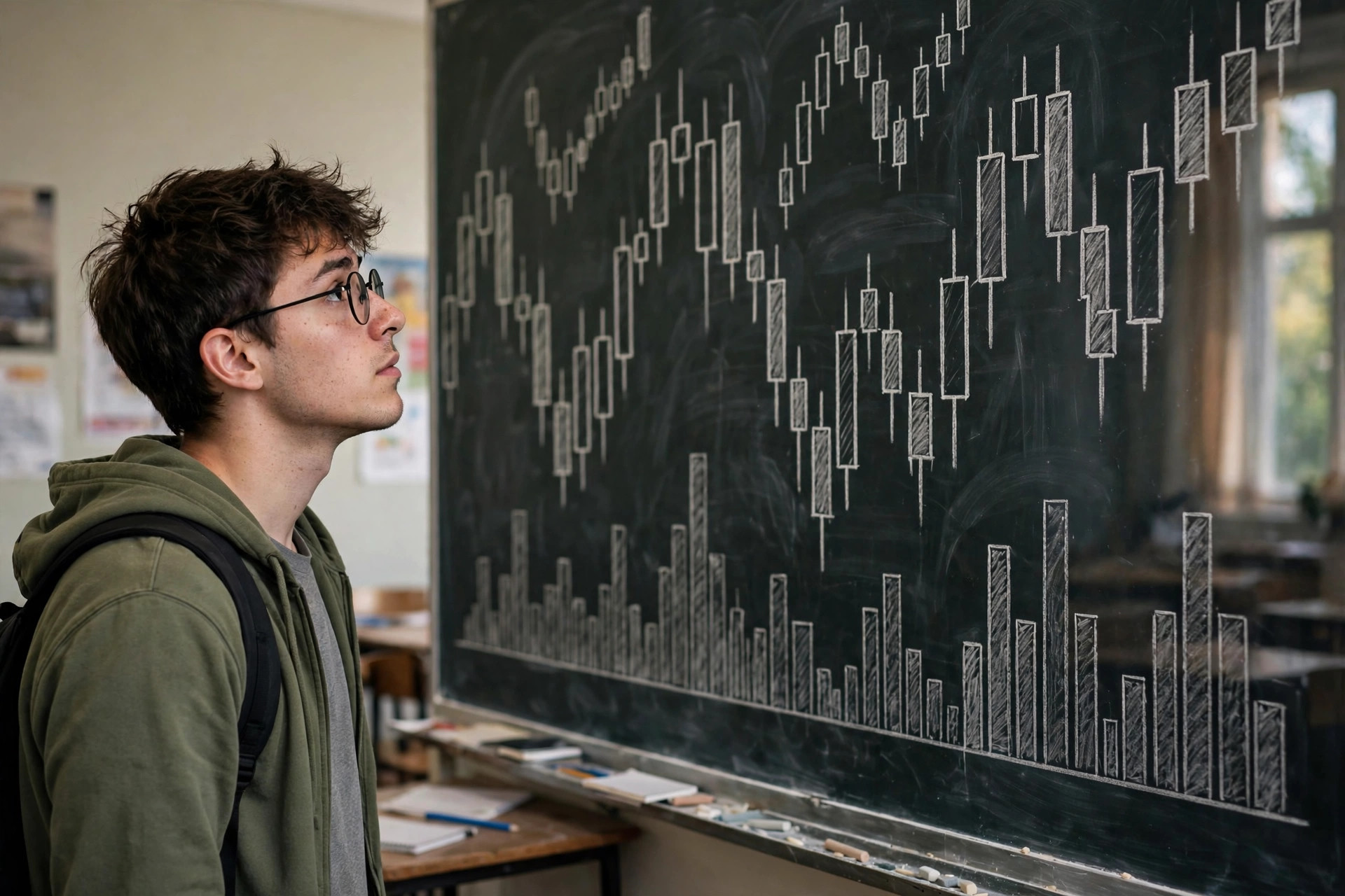
A candlestick packs one period's trading into a single symbol. The thick part, the body, spans the opening and closing prices. Thin lines above and below, the wicks or shadows, reach the period's highest and lowest trades. If the close is above the open, the candle is usually coloured green or white — buyers pushed the price up across the period. If the close is below the open, red or black — sellers won the period. A long body means a decisive period; a small body means a near-draw. Long wicks show rejection: price travelled far, then was pushed back — a long upper wick after a rise, for instance, records that buyers tried higher prices and sellers forced a retreat by the close.
Single patterns have names beginners love to memorise — a tiny-bodied candle is a doji, a long lower wick with a small top body is a hammer — and honest teaching about them requires an immediate qualification. A pattern records what happened within one period, in one context. The same shape means different things after a long fall, after a long rise, or in the middle of nowhere, and none of them, alone, predicts the next candle with reliability you could bank on. Their beginner value is different and real: reading candles forces you to see each period as a small contest with a high, a low and a result, rather than as a smooth, inevitable line. That contest-view is correct — prices are set by opposing orders, as the guide to PSX order matching explains — and it inoculates you against the idea that price moves express a single opinion. Practise by narrating charts backward: for any ten candles, say out loud what buyers and sellers did. You are learning description, and description done well is 80 per cent of chart reading.
Volume, usually drawn as bars under the price, completes each period's story. It counts shares traded, answering the question price alone cannot: how much conviction, or panic, or mere participation sat behind that move? A price rise on heavy volume means many shares changed hands at rising prices; the same rise on thin volume may be three small orders in an illiquid share, fragile and easily reversed. Falls on heavy volume show urgent selling — sometimes capitulation, sometimes informed exit; the chart cannot tell you which. Beginners should learn one volume habit deeply rather than twenty shallowly: distrust moves that happen on unusually low volume, and respect that in thinly traded PSX small-caps, both price and volume can be staged by a few actors — the anatomy behind the pump-and-dump schemes this site warns about elsewhere. Volume confirms that something happened. It never certifies why.
Moving averages, trends, support and resistance
A moving average smooths price by averaging the last N periods — the 50-day and 200-day are the common long views — and draws the result as a line that lags behind price, because it is built from the past. That lag is not a flaw to be apologised for; it is the definition. A moving average tells you the average price at which recent holders transacted and whether current price sits above or below it. Traders watch relationships: price above a rising 200-day average is described as an uptrend; crossovers between shorter and longer averages are traded as signals by some. As description, this is legitimate and often clarifying — the 200-day line turns a jagged year into one readable sentence. As prediction, treat crossovers with deep scepticism: they are late by construction, they whipsaw in sideways markets generating repeated small losses and costs, and their fame means any genuine edge is competed over by professionals with better tools. If you use averages at all as a beginner, use them as a regime filter and a calming device — am I looking at a rising or falling long-term trend? — never as a vending machine for buy and sell orders.
Trend itself is a description, not a force. An uptrend is a sequence of higher highs and higher lows; a downtrend the reverse; a range is neither. Trends persist often enough to be worth respecting — fighting a strong trend with your whole portfolio because the price feels too high or too low is a classic beginner loss — yet every trend in history has ended, usually without ringing a bell at the turn. Support and resistance name levels where price previously stalled or reversed: former highs, round numbers, zones of heavy past trading. They exist largely because humans remember prices and anchor on them — the investor who bought at Rs 100 and swore to exit at break-even is literally future selling pressure at Rs 100. That makes these levels real but soft: they hold until they do not, breaks through them can accelerate moves as anchored orders trigger, and a level drawn on a thin stock's chart may reflect two trades and no psychology at all. Draw them lightly, in pencil, as questions — will sellers defend this area again? — rather than as walls in a fortress.
Other indicators crowd every charting platform — relative strength index, MACD, Bollinger Bands and dozens more. Each is a mathematical transformation of the same price and volume data, dressed differently. None adds new information; each highlights a facet, momentum or volatility, at the cost of lag and false signals. A principled beginner ration is one or two tools understood deeply — say, candles plus volume plus a single long moving average — over ten indicators understood as incantations. When two indicators disagree, which is often, beginners add a third. Professionals instead ask whether the trade idea was sound in plain language before any indicator was consulted. If it was not, no combination of oscillators will baptise it.
What charts cannot do: the limits section, in bold print
Charts contain no information about value. They cannot show that a company is profitable, indebted, fraudulent or about to lose its biggest customer, except insofar as other traders learned it first and traded — sometimes wrongly. A beautiful chart on a terrible business is how momentum traps close on beginners who never opened an annual report. Charts also invite pattern illusions: human vision finds heads, shoulders, flags and faces in random noise, and financial data, shuffled randomly, produces charts that look convincingly structured — a demonstration every beginner should see once. Add survivorship in teaching: the examples in trading courses are the patterns that worked, selected afterward from thousands that failed in silence. None of this makes charts useless. Maps are useful without predicting traffic accidents. It makes them descriptive instruments that must be paired with fundamentals, position sizing and humility — the orientation of volatility explained simply, where price movement itself is put in its proper place.
Costs are the quiet executioner of chart-based trading. Every signal obeyed is a trade; every trade pays commission and the bid-offer spread, and frequent trading also realises taxes and slippage in fast markets. A strategy whose chart logic is vaguely right can still lose money after costs, while a broker's revenue rises with your activity — the incentive problem examined in how brokers make money. Ask of any chart method the accountant's question: how many trades a year, at what average cost, and what gross edge survives that toll? If the presenter has never shown after-cost results across a full market cycle, including a falling one, you are watching marketing with charts as props. Paper-trading a method for months, logging every signal and cost honestly, is tedious and therefore rarely done — and is the only beginner-safe way to test whether a method deserves real rupees.
There is also a behavioural limit that no indicator fixes: charts reward attention, and attention, in excess, degrades decisions. Watching minute charts manufactures urgency, converts normal volatility into personal threat, and tempts overtrading exactly as the biases literature predicts. Several investor studies in developed markets find the most active traders underperform the least active, after costs. The chart is not at fault; the dosage is. A long-term investor's sane dosage looks like this: weekly or monthly charts to know the landscape, daily charts occasionally around a planned decision, and minute charts never. If you find chart-checking has become the hobby and owning good assets the excuse, reverse the proportions before the fees teach the same lesson at full price.
A beginner's chart routine that stays honest
Put it together as a short routine for reviewing a share you already own or are researching on fundamental grounds. Step one: open the monthly chart, adjusted, and narrate the story in words — where price has been over years, where the big falls and recoveries sit, what a buyer at each stage experienced. Step two: drop to the weekly chart with volume and the 200-day or 40-week average, and describe the current regime: rising, falling or range-bound, active or thin trading. Step three: check the daily chart only for timing hygiene — is today a panic spike or a euphoric gap upward, on freak volume, where patience of a few days might avoid transacting at the week's most emotional price? Sometimes the answer will still be to proceed with your plan; charts inform execution at the margins, they do not veto fundamentals. Step four: write two sentences in your decision journal — what the chart shows, and what it cannot show about this company — and keep both. That second sentence, practised monthly, is worth more than any pattern memorised.
Use charts, finally, for risk housekeeping rather than prophecy: noticing when a holding has run so far above its long average that it dominates your portfolio and trimming restores balance; recognising that a share you assumed was liquid in fact trades by appointment; seeing that your entire portfolio fell together, a diversification fact worth knowing before a crisis rather than during one. These are humble uses, and humble is the register in which charts repay study. The dramatic register — predicting turns, calling tops, day-trading a salary away on candle patterns — has a documented casualty list in every market, and the PSX's thin names and daily price limits add local hazards of their own. This article is educational content, not financial advice, and it recommends a specific humility: learn to read charts as history, let company fundamentals and your own plan make decisions, and treat anyone promising the charts reveal the future as revealing something about themselves instead.
Key takeaway: candles show each period's contest, volume shows how much trading sat behind a move, and moving averages describe the trend that has already happened. Charts describe the past well; they do not reliably predict the future, and no indicator changes that.